7 UX Principles for Creating a Great Website

Every user should be able to access and use the same features, therefore UX design is based on 7 principles: usability for all, adaptability to different situations, ease of use, clear and concise information, minimal physical effort, and excellent physical clearance.
We spend a lot of time online, navigating websites and using web apps. In some situations, our user experience falls short of expectations.
All consider UX design that did not take user experience into consideration. It’s simple to identify these mistakes, but it’s a little bit tricky when you’re in charge of a project.
As designers, it is our responsibility to create designs that provide a positive user experience. And it isn’t easy. Here are some UX best practices for web projects.
1. The design should be centered on the user’s requirements and desires.
There should be more focus on creating a memorable experience than there should be on the content of the website. People will recall how content made them feel long after they’ve forgotten the facts and details it contained. Since it is effective in marketing, why not apply it to online material?
User experience is created by the coordinated use of visuals, structure, text, and interactivity. The UX design of an app or website is essential.
There is so much information and websites that yours must stand out. To stand out in today’s saturated market, websites have ramped up their use of graphic and interactive elements to appeal to visitors’ emotions.
2. Websites are scanned, not viewed
Websites must be easily scannable because users do not read them. In today’s information-heavy world, everyone with data or instructions to share must resort to infographics and other visuals.
It is easier for readers to quickly read your content if it is formatted for easy scanning. Most people will preview an article in search of anything interesting, and then read it in depth if they’re interested in learning more about that topic.
3. Users Want Simplicity.
Users evaluate a website’s design in half a second, so identify what you want them to accomplish and make it clear. Avoid hiding action buttons. Focus on the main button instead of a plethora of home page buttons.
Always consider ways to simplify your app or site. The design makes it usable for most users and allows extra functionality to be buried and revealed as needed.
Clear, consistent design simplifies use. Reusing colors, behaviors, and aesthetics help them understand the UI. User familiarity with design elements simplifies the process.
4. Creativity vs. Common Design Elements
Don’t try to be too smart by coming up with brand-new UI patterns for elements that are already widely used elsewhere. You don’t want your users to have to invest too much mental energy to figure out your UI. Make links stand out and place the login form in the top right corner for a familiar user experience. Moving universal parts is useless.
A lack of standardization in your interface’s design can make it frustrating to use. Though the unconventional design may appeal to your sense of style, it could prove to be a challenge for your target audience. There should be a middle ground between originality and practicality.
When planning URLs, button placement, and navigation, usability must come first. The design should come after the layout has been completed.
5. Be Aware of your Target Audience
Before creating a website or app, you must know its audience. They’ll decide on the interface design.
Knowing your website or app’s consumers helps you develop for their needs. You can learn from the competitors. Consider the competitor’s colors, designs, style, and features.
Use familiar styles and patterns to ease visitors into your site. Your needs-based ideas will set you apart.
After identifying your audience, include their feedback in your design. Actionable user input is valuable.
6. Display Hierarchy
Highlight key UI elements to draw attention. Designing something larger than the screen is the most effective approach to highlight it. Many websites advertise sales or “click here” buttons by emphasizing them.
7. User Experience.
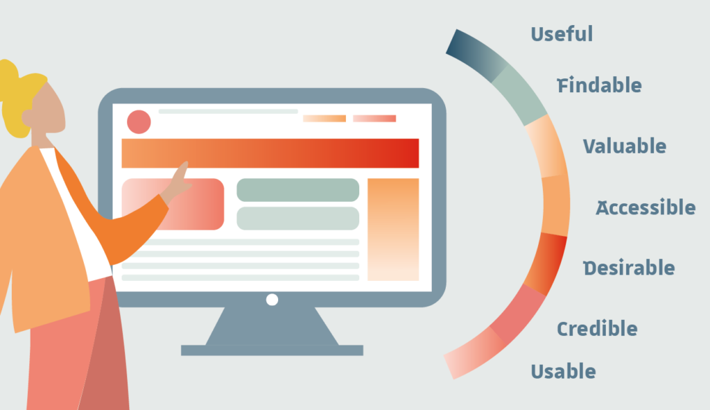
Your client’s value is wrapped by hexagonal shapes:
- Useful – Original, useful content.
- Usable – Easy to find.
- Accessible to disabled users.
- Credible – Users must trust your claims.
- Other UX theories exist. Building UX involves more:
- Mark user progress via the UI.
- Be human – trustworthy, open, and approachable.
- Be searchable – Ensure first-time visitors may complete their responsibilities.
- Be easy to use and navigate. Ensure repeat visitors can achieve their goals.
- Are they efficient at repeating tasks?
- Delight users to create an emotional connection and promote your goods.
- Perform well when people interact with the system.
Conclusion
Users must feel a personal connection to your offering to purchase them. You won’t attract enough customers to your product’s success if you’re only making an interface, rather than an experience. The best user interfaces (UIs) are those that are easy to use and are designed with the target segment in mind. Consistency is key, as is remembering to consider end-user feedback throughout the website design process.
Other articles
-

Discover our online Master’s CAWEB Program in digital communication
-

Art Direction for the Web: Not Just Relevant for Print Media
-

What is evergreen content and why is it important for your website?
-

The Indispensible “Mobile-First”
-

The Importance of Visual Hierarchy for an Optimized User Experience


