 Master CAWEB
 Minimalism Versus Density in UI and UX

A Global Lens on Culture, Design and User Experience
Introduction: Beyond a Style Debate
Minimalism versus density in UI and UX is often framed as a visual preference. Clean screens versus busy ones. Calm brands versus loud ones. But this framing misses what is really at stake. Minimalism and density are not opposing aesthetics. They are different strategies for managing attention, trust and effort. They also reflect deeper cultural norms about how information should be presented, how much guidance users expect and what “good service” looks like in a digital space.
Across industries and geographies, designers are constantly negotiating how much to show and how much to hide. From government portals to ecommerce platforms, the balance between minimalism and density shapes how users feel, decide and act.
Defining Minimalism and Density in UX

Minimalism in interface design is the discipline of removing what does not directly serve the user’s task. It relies on hierarchy, whitespace, restrained typography and a small set of components so the user can immediately understand what matters. Nielsen Norman Group, a leading UX research firm founded by Jakob Nielsen and Don Norman, describes this approach through its “aesthetic and minimalist design” heuristic, which argues that unnecessary elements compete with essential content and increase cognitive load.
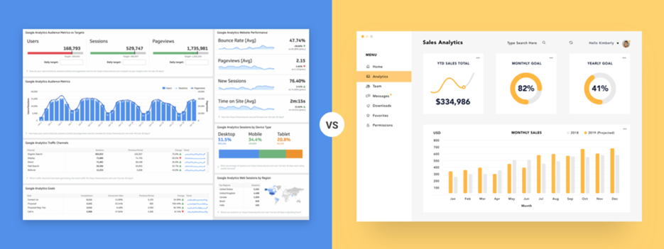
Density, by contrast, is an information strategy rather than a stylistic one. A dense interface seeks to surface more options, more context and more controls at once so users can act quickly without excessive navigation. Density is often misread as clutter, but in many environments it is a form of efficiency. It signals that nothing is hidden and that the system is capable and responsive.
Maximalism and Density: Related but Not the Same

Maximalism is primarily an aesthetic posture. It embraces ornament, contrast, visual layering and expressive branding. Density can be maximalist, but it does not have to be. A financial trading dashboard can be visually restrained and still be dense because it exposes many data points and tools at once. A highly decorative landing page can be maximalist without being functionally dense if it still forces users into narrow, linear actions.
This distinction matters because design debates often confuse visual noise with functional richness. In UX terms, density is about information availability and interaction breadth, while maximalism is about visual language and cultural expression.
Cultural Norms and Interface Expectations


Cultural context strongly influences whether minimalism or density feels usable. One useful lens is the idea of high context versus low context communication. Low context cultures tend to value explicit, simplified communication where meaning is contained directly in the message. High context cultures are more comfortable with layered meaning and implicit signals.
In many Western markets, minimalist interfaces have become associated with modernity, trust and premium quality. Sparse layouts and focused calls to action imply confidence and control. In several East Asian markets, richer navigation and higher information density can signal usefulness, transparency and value.
Japan is a frequently cited example. To Western users, Japanese portals can feel overwhelming. To local users, they can feel efficient because they expose many categories, promotions and updates at once. Yahoo Japan and Rakuten Ichiba illustrate this logic clearly. Their layouts are dense, but structured. The abundance of links reduces the need for deep navigation and reassures users that everything they might need is visible.
China’s super app ecosystem reflects a different cultural and infrastructural logic. Platforms like WeChat, Alipay and Meituan integrate payments, messaging, shopping and services into a single interface. This produces visually dense home screens, but users experience them as convenient because they represent an entire digital environment rather than a single function. Density here is not visual excess. It is ecosystem design.
Minimalist Global Interfaces
At the opposite end of the spectrum are minimalist global brand sites. Apple’s product pages are a well known example. They use large imagery, limited color, short text blocks and focused interaction points to create a narrative experience. The user is guided through a story rather than confronted with a menu of options. This works particularly well when the goal is emotional engagement and brand differentiation rather than transactional efficiency.
This model also appears in many startup landing pages, cultural institutions and portfolio driven platforms where attention and clarity are more valuable than speed and breadth.
Hybrid Models and Progressive Disclosure
The most interesting contemporary interfaces do not choose between minimalism and density. They combine them. Progressive disclosure allows designers to present a simple default state while revealing complexity only when needed. Filters, advanced settings, expandable tables and layered navigation are all examples of this logic.
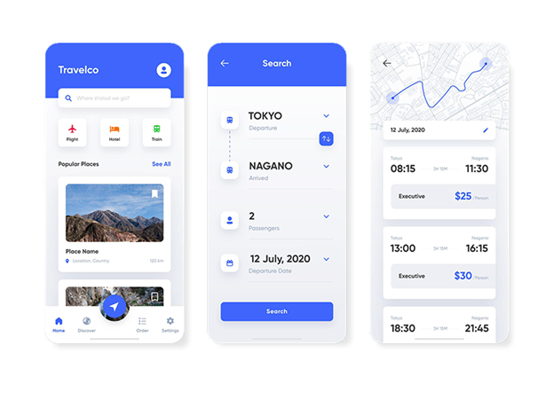
Mobile interfaces demonstrate this particularly well. Limited screen space pushes designers toward minimalism at the surface, but effective mobile experiences still provide density through search, personalization and saved states. The interface looks calm, but it contains depth.
Historical Evolution of Density and Minimalism
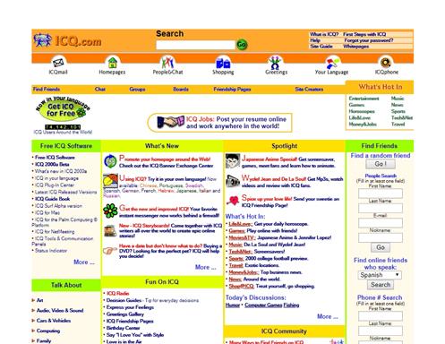
The web has oscillated between density and minimalism since its beginning. Early websites in the 1990s were crowded and unstructured. Later design movements emphasized clarity, whitespace and simplicity. The rise of mobile accelerated minimalism, while design systems standardized visual language across platforms.
Recent years have seen renewed interest in depth and richness through motion, layering and glass like effects. What changes is not only taste but also technology, bandwidth, accessibility expectations and user maturity.
Trends Toward 2026 and Beyond
Adaptive density is emerging as a dominant pattern. Interfaces increasingly adjust what they show based on user behavior and context. This does not mean constant redesign. It means stable structures with flexible prioritization.
Agentic AI will further shift the balance. As systems begin completing tasks on behalf of users, the visible interface can become simpler while the underlying logic grows more complex. The role of UI shifts toward showing state, explaining actions and providing control rather than exposing every possible option.
At the same time, density will intensify in professional and expert tools. As AI and automation increase capability, competitive advantage will come from how clearly complex systems are presented. Dashboards and editors will become denser but also more structured, emphasizing grouping, hierarchy and cognitive support.
Accessibility and regulation will continue to shape both approaches. Minimalism will be challenged to retain affordances and guidance. Density will be challenged to maintain legibility and focus.
Conclusion: Designing for Context, Not Fashion
The real question is not whether an interface should be minimalist or dense. The question is what clarity means for a given user in a given moment and culture. Minimalism earns attention. Density earns confidence and speed. The strongest UX designs achieve both by aligning structure, culture and intent.
Minimalism and density are not rivals. They are tools. And in an increasingly global and intelligent digital landscape, knowing when to use each is becoming one of the core skills of interface design.
Next and previous articles


Other articles
-

Discover our online Master’s CAWEB Program in digital communication
-

How and Why Google Plans to Fight Against AI Generated Content
-

Web Accessibility: How to Build an Accessible Website
-
DeepL versus Google Translate: A Modern-day David and Goliath Story
-
Celebrating 20 Years of Excellence: The 20th Anniversary of the Master CAWEB